Ruisrock Festival’s visual identity mastered by Ilja Karsikas
So it’s a new year! While it’s snowy and cold outside, it’s a perfect time to dream about the warm and sunny summer! And what is a summer without summer festivals? Our favourite one in Finland is definitely Ruisrock Festival, celebrated in Turku. Year after year it continues to bring the good summer vibes with surprisingly fresh artist line-up and of course the eye-wateringly amazing visual identity – which is aced by Napa’s super-pro illustrator Ilja Karsikas!
Ilja has been working on Ruisrock’s identity since 2013 and it has been very fascinating to follow how the festival’s visual appearance has evolved during the years! So we were dying to know the story behind all the fun illustrations and that’s why we asked Ilja how he came up with the visual identity and how the look has transformed throughout the years.
“From 2013 to 2015 festival’s visual identity was based on the angular vector illustrations and humorous human figures, as well as flowers and ships. In 2016 the bigger change happened in the visual appearance: the illustrations took more abstract shapes and at the same time the color spectrum was taken to a new, cooler direction. However Ruisrock Festival wanted to keep the same, well known logo design, to enhance the brand functioning and the continue he visual identity.
The constant theme of my designs has been the festival’s spectacular surroundings in Ruissalo, Turku. You can see the sea, sun, trees, people and the warm atmosphere of the festival – and I wanted to hold on to that. However I ended up with an interpretation of the theme, but in a bit more abstract way. At the same time, I wanted to insert a little more organic feel to it, so I drew all the elements by hand! Also, I kept the logo design but drew it again in a little more relaxed and rough manner. For this year’s identity I made a few new elements, but continued with the same organic vibe.
While I was hanging out at the festival in previous summers I realized, that the individual graphic elements combined with the abstract and pattern-like illustrations would work better than the realistic elements. After all, the festival is already full of people and all kind of hustle and bustle.”
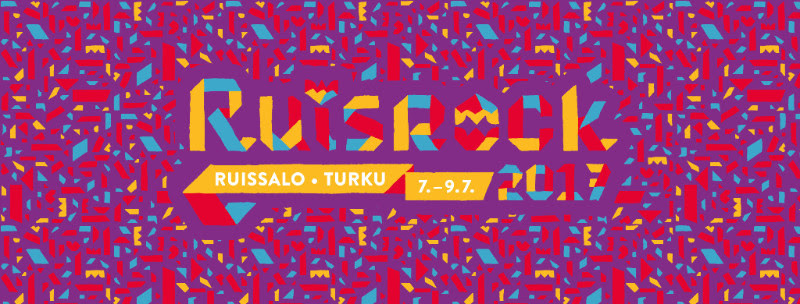
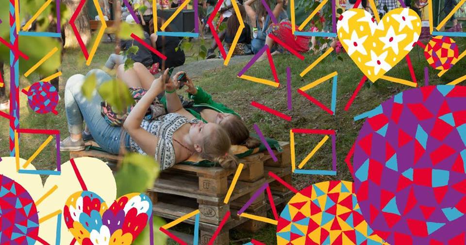
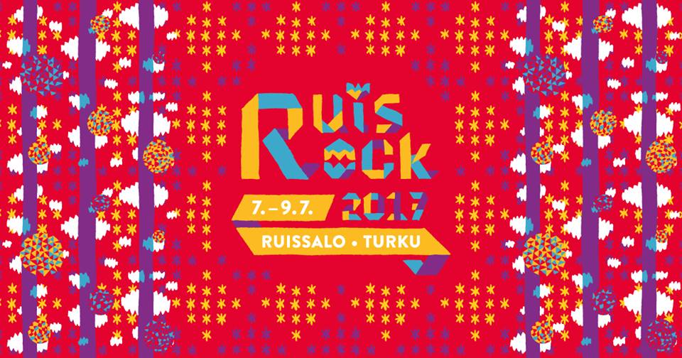
True that! And from what we’ve seen so far in the Ruisrock Festival’s social media channels, the visual identity for 2017 is really a lot more abstract and distinctive than in previous years. Crazy & lively patterns in new vibrant colours, roughly drawn interesting shapes to set your imagination free. It almost looks like a shattered kaleidoscope. See for yourself!
![]()
The visuals look so fantastic and we cannot wait to see what kind of festival merchandise there’s going to be! Last year there were caps, tees, tote bags and even metallic temporary tattoos, so this year the sky is the limit!